OUAN401:
Animation serves many other purposes than just being there purely for entertainment. One of which is advertising. Animation seems to be a very popular strategy in advertising as it is a "lighter" more fun and audience-friendly way of drawing in attention and creating appeal. I'd much rather be brainwashed and compelled to buy that funky, new, super action food blender if it were welcomed on screen by a sweet, little mascot full of expression and charisma than a middle-aged woman who's expressions show that she's been forcefully made to sing that horribly catchy jingle...
The very first animation in the commercial realm (and to my knowledge, the very first animation in history) was created by Arthur Melbourne-Cooper named "Matches: An Appeal" in 1899. This clever little stop motion animation consists of matchstick characters and items formed on a chalkboard taking part in wacky and vivid activities. Back in the day, that was the height of animation technology and would've caught everyone's attention while subliminally forcing its audience to buy those matches!
Animation in video games such as Animal Crossing: Wild World can actually be more sinister than we think. Although this is aimed at children, it sets a very standard way of living right from the start of the game. The aim of the game is to work as hard as you can to afford the biggest and nicest looking house. It introduces capitalistic values such as mortgages, consumerism, working for a living etc. It is however beneficial as you acquire social skills through talking to the animals, although this could be seen as negative as in some circumstances the animals will not visit you if you do not have a nice house and will criticise you if so.
Saturday, 21 December 2013
OUAN401 - Context of Practice: Auteurship and The Avant Garde
OUAN401:
Auteur Theory:
That the word "auteur" practically means "author". This film theory is associated with a man called Andre Bazin, a French critic. It is also associated with writers for Cahiers du Cinema in the 1950s. Film directors are artists in their own rights, they are on par with novelists and great writers as it is a very similar form of art. Films made by a true auteur follow a thematic consistency throughout their work i.e Tim Burton and so forth.
Auteur Theory in Animation:
Animations echoes large scale film production processes - very true, however a great deal more of effort is put into animation as this incorporates more artistic skill in my opinion. It offers for a filmmaker to work entirely alone, freelance etc. It could be seen as and argued to be one of the most auteuristic of film practices. However, few animators have the recognition of being an auteur as they mostly reside under a corporate identity such as Disney or Pixar.
Although Disney is a key figure or art and animation and started out as a one-man band, the companies do follow a set of stylistic processes and techniques and it is definitely easy to recognise a Disney or Pixar film as they follow a set of conventions throughout their films. It is the epitome of the American Dream (in my opinion, can be too tongue in cheek, cheesy, unrealistic ideas of life). Very politically incorrect.
Caroline Leaf is seen as a more traditional, avant garde artist/filmmaker. She uses the process and technique of scratching into the raw film with paint to create a very textured and abstract appearance.
OUAN401 - Context of Practice: Genre
OUAN401:
What is Genre?
Genre is a means of categorising anything from film and books to periodicals and even music. Genre gives the audience an idea of what the contents of a particular piece of entertainment are. This enables the audience to make quick assumptions on whether or not they might find something appealing to them.
It sometimes becomes contradictory and deficient and can help you think outside the box as to how particular narrative structures work in animations that are compliant with a particular genre. Discrete categories defined by particular features, be it visual, thematic or subject. Cinematic conventions.
Genre in Animation:
There are deemed to be six generic plots that animation (and this could be said for other types of entertainment media). These of which are: Maturation (coming of age), Redemption (protagonist transfers from bad to good), Punitive (good character behaves badly and is punished for wrongdoings), Testing (willpower versus temptation), Education (protagonist moves from negative to positive perception of world), and lastly, Disillusionment (positive to negative perception of world).
Paul Wells' Seven Genres of Animated Film:
1. Formal
2. Deconstructive
3. Political
4. Abstract
5. Re-Narration
6. Paradigmatic
7. Primal
Wednesday, 6 November 2013
OUAN401 - Context of Practice - Lecture 4 - Chronologies: Illustration
COP1:
This lecture is particularly relevant to me as I applied for Illustration prior to being accepted on the Animation course and got rejected as apparently my style leaned more towards an animation-style approach. However, my interests are still deeper into Illustration than Animation.
What is Illustration?
In my honest opinion, Illustration is a mixed bag of modern and traditional styles mixed together to create a whole new kettle of ideas. Illustration is a means of communication and is "strategic image making", "a shining, a spiritual illumination, vivid representation, an enlightenment" and so forth. It is a mix of image, context and concept. All three of these things can collide and create illustrations. It can't be considered illustration is there is a lacking of one of these three things. There most definitely has to be concept, con text AND image.
Tone of voice refers to the notion of style. It is the strategic aesthetic that you decide to incorporate into your work. It could be argued that using computers and software removes the tone of voice of from a piece as there are no real decisions made. Mouk by Mark Boutavant to me would be considered as having a great tone of voice in his work as it looks appealing and has character. Drew Millward's work is full of character, and is extremely "hardcore" in the sense of what it's trying to achieve.
Illustration primarily resided in publishing and newspapers. As the recession goes on, work is harder to find as people simply want content with no budget for extras. However, there is always work out there for illustrators be it in advertising, video games etc.
In my humble opinion, Brian Kesinger has always been my favourite illustrator as albeit an Disney character designer, his work is beautiful, has purpose and gives off a real "atmosphere" of Victorian and Steampunk artwork.

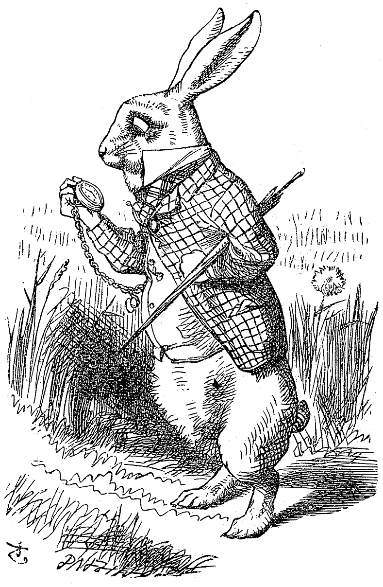
Again, a very traditional style by John Tenniel, the illustrator of the original Alice's Adventures in Wonderland is appealing as although there's an obvious lack of colour, we still don't lose any of the story and it leaves more to the imagination. Again, my favourite media was used (inks and fineliners) to create his work. Here is an example by John Tenniel:


This lecture is particularly relevant to me as I applied for Illustration prior to being accepted on the Animation course and got rejected as apparently my style leaned more towards an animation-style approach. However, my interests are still deeper into Illustration than Animation.
What is Illustration?
In my honest opinion, Illustration is a mixed bag of modern and traditional styles mixed together to create a whole new kettle of ideas. Illustration is a means of communication and is "strategic image making", "a shining, a spiritual illumination, vivid representation, an enlightenment" and so forth. It is a mix of image, context and concept. All three of these things can collide and create illustrations. It can't be considered illustration is there is a lacking of one of these three things. There most definitely has to be concept, con text AND image.
Tone of voice refers to the notion of style. It is the strategic aesthetic that you decide to incorporate into your work. It could be argued that using computers and software removes the tone of voice of from a piece as there are no real decisions made. Mouk by Mark Boutavant to me would be considered as having a great tone of voice in his work as it looks appealing and has character. Drew Millward's work is full of character, and is extremely "hardcore" in the sense of what it's trying to achieve.
Illustration primarily resided in publishing and newspapers. As the recession goes on, work is harder to find as people simply want content with no budget for extras. However, there is always work out there for illustrators be it in advertising, video games etc.
In my humble opinion, Brian Kesinger has always been my favourite illustrator as albeit an Disney character designer, his work is beautiful, has purpose and gives off a real "atmosphere" of Victorian and Steampunk artwork.

Brian Kesinger's - "Walkies for Otto"
The above image is most definitely one of my favourite illustrations. I like the use of colour, linework and media. He uses coffee and inks to create this watery effect. Also, the abstract idea of taking an octopus for a walk brings a few smiles.
Again, a very traditional style by John Tenniel, the illustrator of the original Alice's Adventures in Wonderland is appealing as although there's an obvious lack of colour, we still don't lose any of the story and it leaves more to the imagination. Again, my favourite media was used (inks and fineliners) to create his work. Here is an example by John Tenniel:
George Butler is a recognised illustrator who recorded his experiences in Syria for The Times. He recorded through drawings to give the people a new perspective on the war in Syria and the real gritty truth of what was going on.The New Yorker is also a popular newspaper that features work from genuinely great illustrators such as Saul Steinberg.
Another of my favourites, Gloomy Bear by Mori Chack is also considered a phenomenon in popular culture as this Japanese style cartoon (right up my alley!) has taken the merchandise world by storm by selling fancy dress, toys, clothing and plushies.

Tuesday, 15 October 2013
OUAN401 - Context of Practice - Visual Analysis Exercise
OUAN401 - Context of Practice:
Upon watching both Jiri Trnka's "The Hand" 1968 (or Ruka in Czech) and Zagreb Film's Ersatz 1961 (or Surogat in Croatian although being a Yugoslavian short), I noticed that although from the same time period and both being Eastern European, they were completely different in terms of what message they were trying to achieve and portray about life at that particular time in history.
For instance, Ruka, as I touched on in an earlier blog post carried the metaphor of a controlling government around with it during every second of that animation. The government loomed over the sculptor and invaded every aspect of his life - his home, his career and even his funeral! In fact, the Hand was indeed the protagonist; the animation's title proves this. Through watching this, I understood that political life in late 60s Czechoslovakia was not very pleasant and the animation itself deemed the government as very sinister and suffocating to the point of death in this case.
Zagreb Film's Surogat however shed a completely different light on Croatian life and although the two countries are hardly poles apart, life seemed a little less strenuous and daunting in this animation. Unlike Ruka, this animation is incredibly colourful, fun, humourous and intends to make us laugh. It shows us a carefree lifestyle as the main character spends his day chasing women on the beach and having a picnic rather than trying to escape the wrath of an "omnipotent" and God-like hand that has the power of controlling one's life entirely.
In fact, that's rather the case in Surogat: the protagonist has complete control over his life. The way he blows random objects up as if they were balloons into anything he desires signifies that having material possessions and enjoying life the way you want to in Croatia at the time was probably not as difficult as it would have been in Czechoslovakia. While artists in the now reformed Czech Republic lived through the Censorship of the Arts - meaning the government could pass judgement as to whether or not a piece was suitable for public viewing - meant that in a sense, the government did have complete control over what you did. Politically speaking, the Hand is protest against a communist government.
In terms of target audience, I imagine that with some sexual references, Ersatz would've been aimed at everyone as it had a fun and friendly atmosphere and rather that having a rant at the way the state or country is governed, it seems more of a celebration of freedom on Yugoslavias part. However absurd and unlikely the animation seems at first, after a while you begin to understand the message and begin to enjoy it. You feel empathy for the protagonist when he is rejected by the woman for a "better looking" man. We understand that although he is lonely and upset that he cannot find love, he doesn't really care because in light of it all, he still has his freedom.
Ruka however is probably aimed at an older audience as it seems far too sinister to show a young child. Although I thoroughly enjoyed this animation, I was a little frightened at first due to the dark lighting and gloomy setting. The character's over-sized beak-like nose and blackened eyes were a little daunting also. So, with such muted colour and lack of humour in comparison to Ersatz, I do not think it would be suitable for a young audience. With the message of politics, a young audience would not understand let alone find this half as entertaining as the aforementioned.
Sunday, 13 October 2013
OUAN401 - Context of Practice - Fraktur, Universum and Times New Roman (Graphic Design - Typography)
OUAN401 - Context of Practice:
Along with our animation lecture regarding Ruka, I also found something very particular in terms of the graphic design section of the presentation. The political comparison and influence of three completely different fonts (Universum, Fraktur and Times New Roman) was remarkable!
My favourite in terms of look and appeal personally was Fraktur. As soon as I set eyes on it (I'd seen it many times before and failed to find out its name) I thought it was the most beautiful font I'd ever seen. The reason for this would have to be that although to look at, at first, it seems a very elegant and noble font, after a while of studying each individual letter, each hooked, beak-like serif, we become slightly afraid of it due to the sharpness of the letters in contrast with the sleekness and curvature we see at first glance.
Fraktur includes all 26 letters of the Latin alphabet with the Germanic "S Sharp" and "Umlauts". The word Fraktur translates loosely as "Gothic" and is deemed appropriate as it's roots as a font stem back to the time of the Goths, Huns, and so forth. Likewise, Times New Roman is also named very much after its historical development as a typeface as it derives from Roman scriptures and carvings found on stone.
Both of the above being serif fonts, rather bold, striking and noticeable; Universum is very much different compared to afore mentioned. Universum was created in 1925 by Herbert Bayer (Bauhaus). A sans serif typeface in it's own right with full-bodied letters and a very uniform and similar-looking feel to it, this font was created to do exactly what it's name suggests - become universal. Although this font never got released, unlike the other two fonts' jobs (to be a political letterhead associated with one country almost!), this typeface was created solely to unify everyone and promote equality: a view that may have been needed at such a critical time in politics and history alike.


OUAN401 - Context of Practice - Jiri Trnka's 1965 "Ruka (the Hand)"
OUAN401 - Context of Practice:
During our first Context of Practice lecture last week, we had a short introduction to all the relevant other courses in terms of history, politics, propaganda and so forth. In a way, they all seemed to link very closely in terms of purpose and audience, I particularly enjoyed the topics on Animation, Graphic Design and Creative Advertising.
Aiming towards the animation side, we looked at a rather interesting little animation by the title of "Hand" or "Ruka" (in Czechoslovakian). This was made in 1965 by a man named Jiri Trnka. Ruka in particular was incredibly amazing in the sense that something so controversial could come out to look like a child's animation! I admit, although I found it sweet and innocent at first - a cute little doll who made his way as a sculptor - as the story progressed, it became more and more sinister as the Hand, the antagonist entered.
The hand seemed to be a metaphor for the Czech government in the sense that it controlled everything that the sculptor did. The sculptor was trying to make a decent living for himself but after being wrongfully seduced by the "government" if you will, all further actions in his life were affected by the hand. When the puppet sculpted the hand, the hand rewarded him with medals and a crown of leaves, ironically like a Roman leader, like a war hero or a God!
To me, the moral of this animation was very deep. Once you have done what the government wants of you, they will gift you and praise you and lure you in to yet again run more errands at their will. As soon as you put one foot wrong and try to escape their power, they will hunt you down until the death and even then control your funeral. It's like they have a hold over your will to live...
Subscribe to:
Comments (Atom)